Design Leader.
WESTPAC GROUP

Designing multi-brand, accessible components aligned to GEL
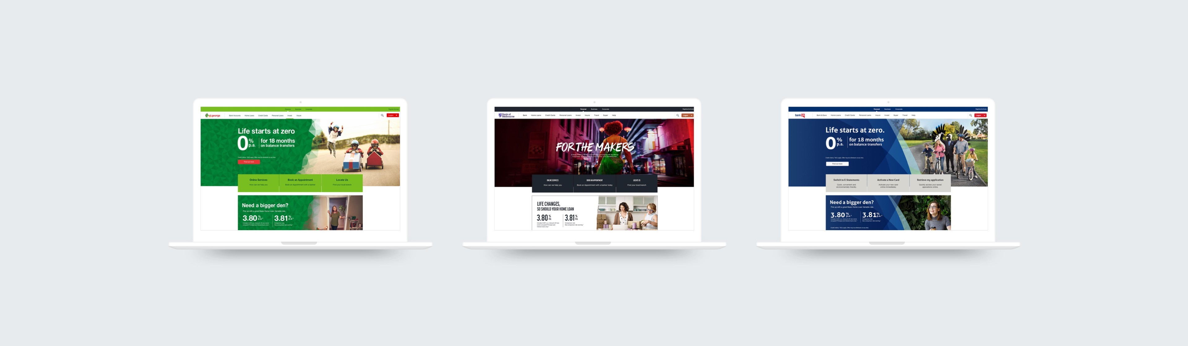
Unifying STG brand websites with a set of universal components to strengthen the user experience.
Design System
UX
UI
The Challenge
Designing multi-brand, accessible components aligned to GEL
The project focused on simplifying website content to create clear pathways for customers to meet their needs. The bank needed to communicate how each service, product, or feature supported those needs, while enhancing the experience without overwhelming users with excessive information.
Roles and Responsibilities
Redesigning 28 components across three brands
As Design Lead, I guided a team of four designers from concept through to release. The role involved executive presentations, securing stakeholder buy-in, and delegating tasks across the team. Our goal was to improve the user experience, modernise the aesthetic, build brand advocacy, and increase conversions. The redesign was built to scale across three brands, meet WCAG 2.0 AA accessibility standards, and adapt seamlessly across all devices.
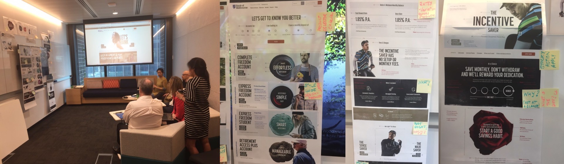
Workshops
Discovery and ideation
The discovery process included three sessions to identify gaps and requirements in the existing components. We gathered and categorised insights from both user feedback and stakeholder input.
Workshops
Discovery and ideation
The discovery process included three sessions to identify gaps and requirements in the existing components. We gathered and categorised insights from both user feedback and stakeholder input.
Workshops
Discovery and ideation
The discovery process included three sessions to identify gaps and requirements in the existing components. We gathered and categorised insights from both user feedback and stakeholder input.
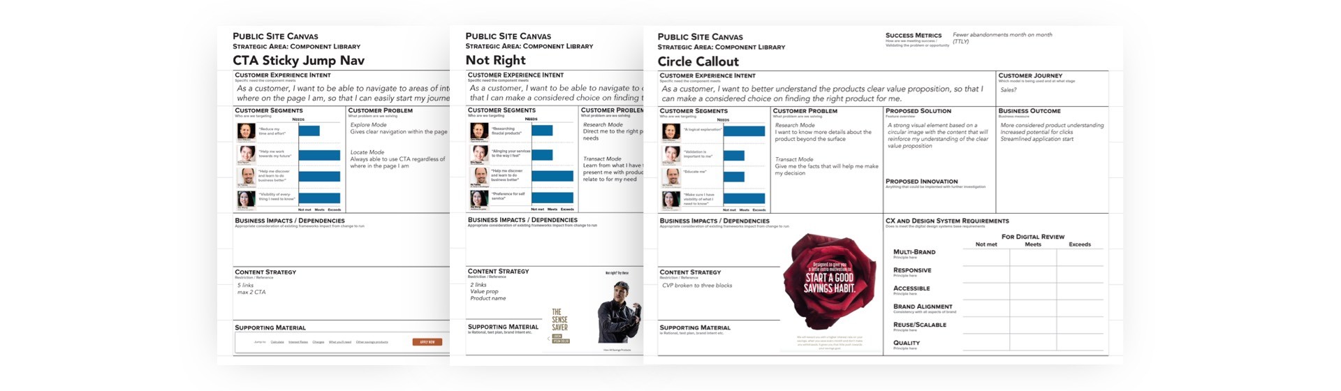
The CX Canvas
Capturing the experience intent
We used a CX Canvas to ensure consistency and quality across all sites. This framework helped translate the desired customer experience into the new component designs, aligning teams on shared principles and creating a clear link between customer needs and design outcomes.
Test and Learn
Getting a fresh perspective
The objective was to design and implement these experiences across key customer journeys, including the home page, category pages, and product pages. These deliverables were then used to test and learn, informing the rollout across the Bank of Melbourne website and later extending to St.George and BankSA websites.
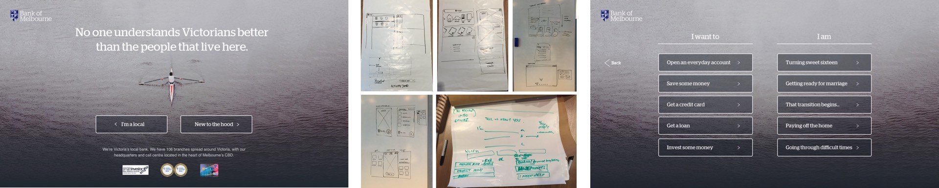
Prototyping
Design validation
Several interaction models were explored, with the top two tested with users. Feedback on the prototypes was positive, and the results informed the homepage layouts developed for release.
Prototyping
Design validation
Several interaction models were explored, with the top two tested with users. Feedback on the prototypes was positive, and the results informed the homepage layouts developed for release.
Prototyping
Design validation
Several interaction models were explored, with the top two tested with users. Feedback on the prototypes was positive, and the results informed the homepage layouts developed for release.
Outcomes
Measuring impact through NPS and conversions
Measuring impact through NPS and conversions
NPS scores were used to measure overall satisfaction with the new design. Results showed the project was well received, with NPS improving from -30 to +10. Analytics also indicated stronger engagement and conversion performance:

15% increase in overall conversions
15% increase in overall conversions
15% increase in overall conversions
23% increase in app starts
23% increase in app starts
23% increase in app starts
43% decrease in bounce rates
43% decrease in bounce rates
43% decrease in bounce rates
41% decrease in exit rates
41% decrease in exit rates
41% decrease in exit rates
Despite these positive shifts, sales volume declined. To address this, the sales team focused on increasing volume and demand while we continued to monitor performance and identify opportunities for improvement.
Voted First Place
Recognised in visually stunning website designs 2017
To top it off, the website was recognised for its unique visual design in the banking sector. For the homepage, I selected a still from a Bank of Melbourne TVC, which was well received by both marketing teams and stakeholders. After launch, the site was featured on thefinancialbrand.com for standing out visually from competitors.